In our interconnected world, understanding global trends is essential. Often, complex information about the world is presented visually in charts, graphs, and maps. In academic and professional settings, especially on tests like the ITEP, you will be asked to interpret this data and communicate its meaning clearly. This lesson will help you develop the skills to analyze visuals that show global inequality and to describe them accurately using precise vocabulary and grammar. We will focus on how to turn numbers and images into a meaningful story, or a "data narrative."
Visual Input
First, carefully examine the two visuals below. They both show information about global disparity. The first is a line graph showing the trend of internet subscriptions over time, and the second is a map showing the distribution of wealth. Think about what main ideas each visual is trying to communicate.
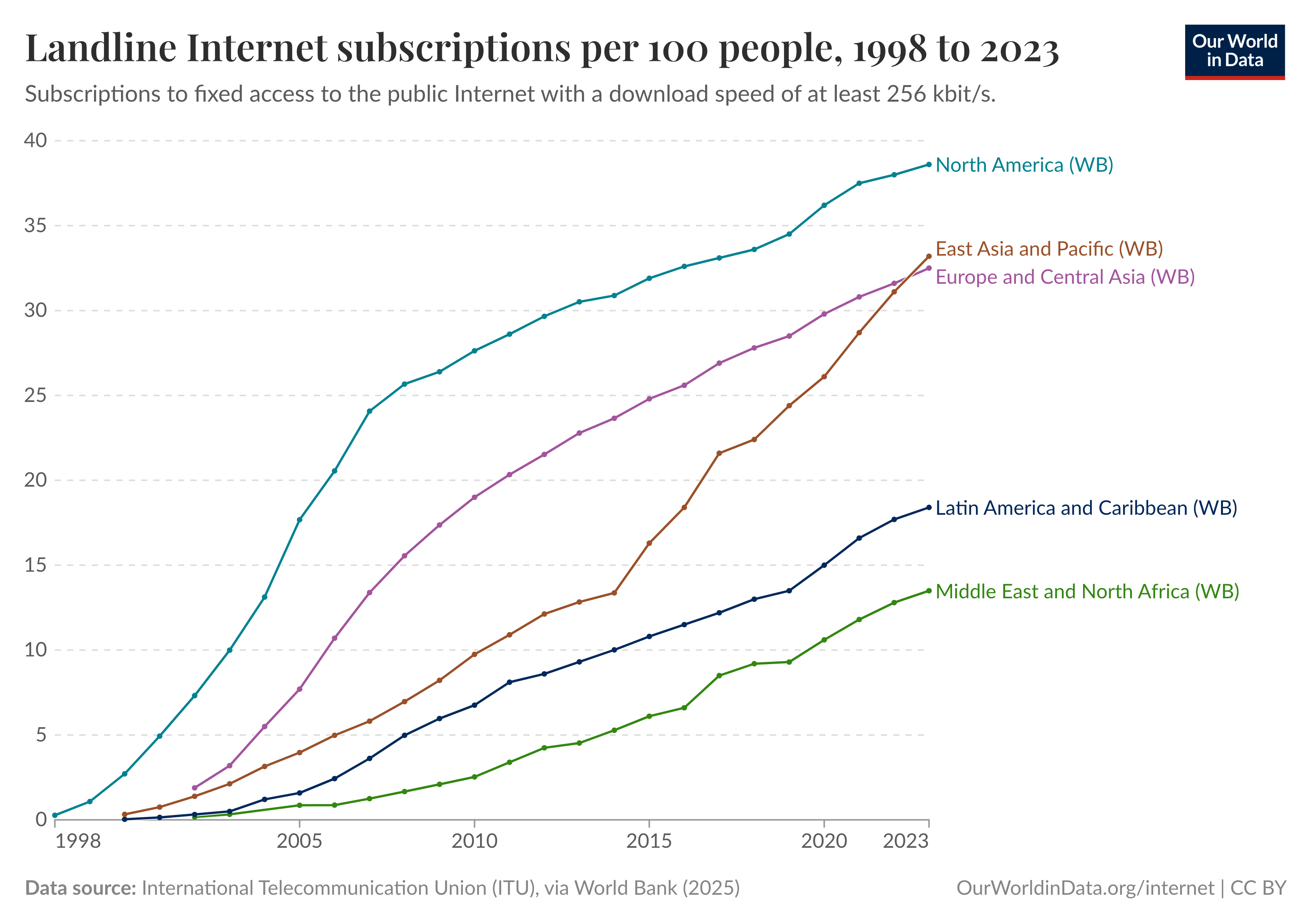
Figure 1. The growth of landline internet subscriptions across different world regions from 1998 to 2023.
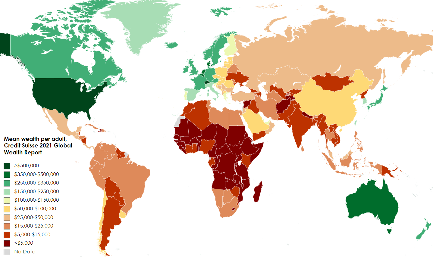
Figure 2. The distribution of mean wealth per adult by country, 2021.
Vocabulary
To discuss data about global inequality effectively, you need the right vocabulary. These words will help you describe the visuals with academic precision.
| Word | Definition | Example |
|---|---|---|
| inequality (noun) | The unfair situation in society where some people have more opportunities, money, etc., than others. | The world map of wealth reveals a significant economic inequality between developed and developing nations. |
| access (noun) | The right or opportunity to use or benefit from something. | The line graph shows that access to the internet has increased in all regions over the past two decades. |
| wealth (noun) | A large amount of money or valuable possessions that a person or country owns. | According to the map, the highest levels of mean wealth per adult are found in North America, Western Europe, and Australia. |
| distribution (noun) | The way in which something is shared out among a group or spread over an area. | The unequal distribution of global wealth is clearly visible on the map. |
| trend (noun) | A general development or change in a situation or in the way that people are behaving. | The primary trend shown in the line graph is a steady increase in internet subscriptions for all regions. |
| percentage (noun) | An amount of something, expressed as a number out of 100. | The line graph shows the number of subscriptions per 100 people, which is another way of expressing a percentage. |
| disparity (noun) | A great difference, especially an unfair one. | There is a wide disparity in wealth between countries colored dark green and those colored dark red on the map. |
Grammar Focus: Describing Data
Unlock full access by logging in. Registered users can explore the entire lesson and more.